GridLayoutPlugin
A 12er grid system for responsive layoutsDescription
GridLayoutPlugin implements a 12er grid system for flexible layouts. A grid is a set of HTML div elements that are styled in a way to arrange content in cells and rows. You may either use its CSS directly to craft grid layouts or use its macros to ease the process of creating the relevant DIV elements.Syntax
%BEGINGRID{...}%
Every grid starts with a %BEGINGRID% macro and must end with an %ENDGRID% macro. It surrounds the rows and columns part of the grid.
| Parameter | Description | Default |
|---|---|---|
| border="on/off" | switch on/off borders between columns and rows in the grid | off |
| class="..." | add a css class to the foswikiGrid element |
|
| style="..." | add inline css styles to the foswikiGrid element |
|
| gutter="1/2/3/4/5" | configure the spacing between columns; the higher the value the more space | 4 |
%BEGINROW{...}%
The BEGINROW may be specified optionally. If omitted will the plugin insert foswikiRow elements as required during the course of adding columns using %BEGINCOL%.
That is when column withds add up to 12 will a new row be inserted automatically.
| Parameter | Description | Default |
|---|---|---|
| border="on/off" | switch on/off borders between columns of this row | the grid's border value as specified in %BEGINGRID% |
| class="..." | add a css class to the foswikiRow element |
|
| style="..." | add inline css styles to the foswikiRow element |
%BEGINCOL{...}%
Starts a new column element; closes any previous column element; closes a previous row element as well if widths add up to or exceed 12.
| Parameter | Description | Default |
|---|---|---|
| "..." or width="..." | specifies the fraction of the row this column spans; values maybe 1, 2, ... , 12 | 12 - <width already being used in the row> |
| border="on/off" | switch on/off borders this and the next col | the border value as specified in the parent %BEGINROW% |
| class="..." | add a css class to the foswikiCol element |
|
| style="..." | add inline css styles to the foswikiCol element |
|
| offset="0-12" | move a column to the right adding left margin; note that this adds to the total of all widths and offsets within a row | 0 |
| pull="0-12" | change ordering by moving a column to the left | 0 |
| push="0-12" | change ordering by moving a column to the right | 0 |
%ENDCOL% and %ENDROW% are fully optional and may be specified explicitly.
Examples
Example 1: hello world
align two cells horizontally
%BEGINGRID%
%BEGINCOL{"6"}%
  hello
%BEGINCOL%
  world
%ENDGRID%
Example 2: dividing rows
a grid with two rows, row one using a 4/4/4 division, row two a 3/3/3/3 division.
%BEGINGRID%
%BEGINCOL{"4"}%
   <!-- content content content -->
%BEGINCOL{"4"}%
   <!-- content content content -->
%BEGINCOL%
   <!-- content content content -->
%BEGINCOL{"3"}%
   <!-- content content content -->
%BEGINCOL{"3"}%
   <!-- content content content -->
%BEGINCOL{"3"}%
   <!-- content content content -->
%BEGINCOL%
   <!-- content content content -->
%ENDGRID%
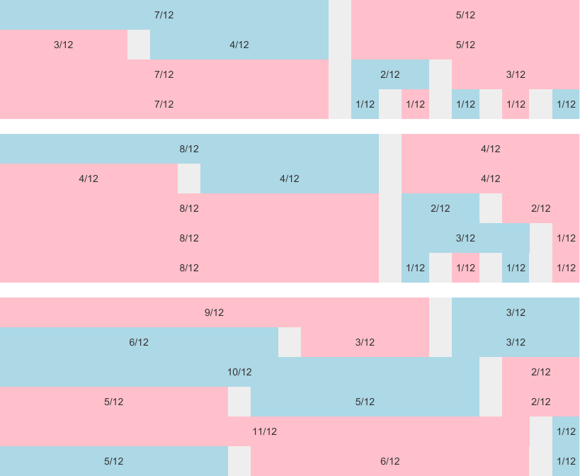
Example 3: all columns

Example 4: mixed columns

Example 5: offset
Example 6: changing column ordering using pull and push
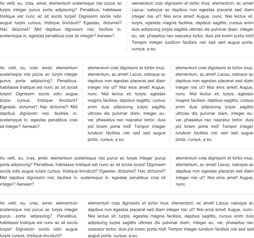
Example 7: text & borders

DOM and CSS
The grid, its rows and cells are all flagged using appropriate CSS class that specifies the configuration of the grid. More specifically a "grid" is made up of "rows" and each row consists of "cells". A row may have up to 12 cells. All cells in a row have to "add up to 12".
<div class="foswikiGrid">
   <div class="foswikiRow">
      <div class="foswikiCol6">

         <!-- content content content -->

      </div>
      <div class="foswikiCol3">

         <!-- content content content -->

      </div>
      <div class="foswikiCol3">

         <!-- content content content -->

       </div>
   </div> <!-- end of first row -->
---
   <div class="foswikiRow">
      <div class="foswikiCol4">

         <!-- content content content -->

      </div>
      <div class="foswikiCol4">

         <!-- content content content -->

      </div>
      <div class="foswikiCol4">

         <!-- content content content -->
      </div>
   </div> <!-- end of second row -->
</div> <!-- end of grid -->
Note that the numbers of all foswikiColxxx elements add up to 12 (6+3+3=12, 4+4+4=12). You may divide a row by any possible decomposition of 12.
Further note that content is only supposed to be placed inside the foswikiColxxx elements. The only exception is a <hr> element (produced by ---)
to draw a border separating grid rows visually.
Grids might also be nested to further subdivide cells with yet another grid element inside.
Note further that you will need to load thegrid.css manually to make use of the CSS classes by adding below line anywhere to the page:
%ADDTOZONE{
   "head"
   id="GRIDLAYOUT"
   text="<link rel='stylesheet' href='%PUBURL%/%SYSTEMWEB%/GridLayoutPlugin/grid.css' media='all' />"
}%
Class list
All below classes are meant to be used as part of a<div class="..."> ... </div> HTML element.
| CSS | Description |
|---|---|
foswikiGrid |
the grid container; contains foswikiRow elements |
foswikiRow |
the row container; contains foswikiColxxx elements |
foswikiCol1, ... , foswikiCol12 |
column definition; contains the net content |
foswikiGutter0, ..., foswikiGutter5 |
margin of the cells in a grid; applies to foswikiGrid element; by default a foswikiGutter4 is applied to any foswikiGrid element |
foswikiBorder |
draws a vertical border separating cells visually; may be applied to a foswikiGrid, foswikiRow or foswikiCellxxx element |
foswikiOffset0, ... , foswikiOffset12 |
move a column to the right |
foswikiPull0, ... , foswikiPull12 |
changes column ordering by pulling a column to the left |
foswikiPush0, ... , foswikiPush12 |
changes column ordering by pushing a column to the right |
Installation Instructions
You do not need to install anything in the browser to use this extension. The following instructions are for the administrator who installs the extension on the server.
Open configure, and open the "Extensions" section. "Extensions Operation and Maintenance" Tab -> "Install, Update or Remove extensions" Tab. Click the "Search for Extensions" button. Enter part of the extension name or description and press search. Select the desired extension(s) and click install. If an extension is already installed, it will not show up in the search results. You can also install from the shell by running the extension installer as the web server user: (Be sure to run as the webserver user, not as root!)cd /path/to/foswiki perl tools/extension_installer <NameOfExtension> installIf you have any problems, or if the extension isn't available in
configure, then you can still install manually from the command-line. See https://foswiki.org/Support/ManuallyInstallingExtensions for more help.
Dependencies
NoneChange History
| 12 Nov 2019 | don't clear before the grid |
| 24 Oct 2017 | use different margins on mobile devices depending on the gutter size |
| 25 Sep 2017 | proper clearfix and borer of columns all being laid out verticaly on mobile devices |
| 30 Jan 2017 | fixed media query for responsiveness |
| 27 Jan 2017 | use all paddings and margins to percentage; better support for sub-grids |
| 11 Jul 2016 | minor css fixes for flexbox browser prefixes |
| 01 Sep 2015 | make grid system symetric; add features "offset", "push", "pull" |
| 31 Aug 2015 | css classes are configurable now |
| 19 Feb 2015 | initial release |
PackageForm edit
| Author | Michael Daum |
| Version | 3.31 |
| Release | 12 Nov 2019 |
| Description | A 12er grid system for responsive layouts |
| Repository | https://github.com/foswiki/GridLayoutPlugin |
| Copyright | © 2015-2019 Michael Daum http://michaeldaumconsulting.com |
| License | GPL (Gnu General Public License) |
| Home | https://foswiki.org/Extensions/GridLayoutPlugin |
| Support | Foswiki:Support/GridLayoutPlugin |
| I | Attachment | Action | Size | Date | Who | Comment |
|---|---|---|---|---|---|---|
| |
GridLayoutPluginSnap1.png | manage | 11 K | 12 Nov 2019 - 11:35 | ProjectContributor | |
| |
GridLayoutPluginSnap2.png | manage | 26 K | 12 Nov 2019 - 11:35 | ProjectContributor | |
| |
GridLayoutPluginSnap3.png | manage | 203 K | 12 Nov 2019 - 11:35 | ProjectContributor |
Ideas, requests, problems regarding DAMASK? Send feedback

